Refactoring for the future: How we built Baton's frontend

Jon Wagoner
June 2, 2023 ⋅ 8 min read
There’s a little magic in getting to set up a new code base from scratch. While it can be scary, with endless options, it’s also very exciting. Most of the time, as engineers, we are hopping on the train while it’s already moving - contributing to an existing codebase that has its own personality and quirks, influenced by the many folks that came before us. One of the little joys of early-stage startup life is getting to handpick the technologies you work with and set things up your way, with an eye toward making life easier in the future.
When I joined Baton, the team had only been writing code for ~6 months, so the complexity was fairly low which helped me get up to speed quickly. During that time, the team had worked with a couple of agencies that did the initial build and some follow-up iterations. The decisions of those teams made sense at the time - but I wanted to take a beat to think through the stack and architecture to make sure we are picking the best tools for the job, and setting ourselves up with a codebase that’s easy to manage with a small and mighty team.
Building for the future
Today, Baton’s product ecosystem has two front-end clients - the marketing site, which we call Moondancer, and our app, which we call Storefront. In my experience, marketing sites tend to take a backseat to software products. They fall out of date, are slower to release feature enhancements, and become harder to maintain over time. Here at Baton, it's important to us that Moondancer is thought of as a first-class product, and the best way to ingrain that early is to ensure that engineers who work on it aren’t siloed there.
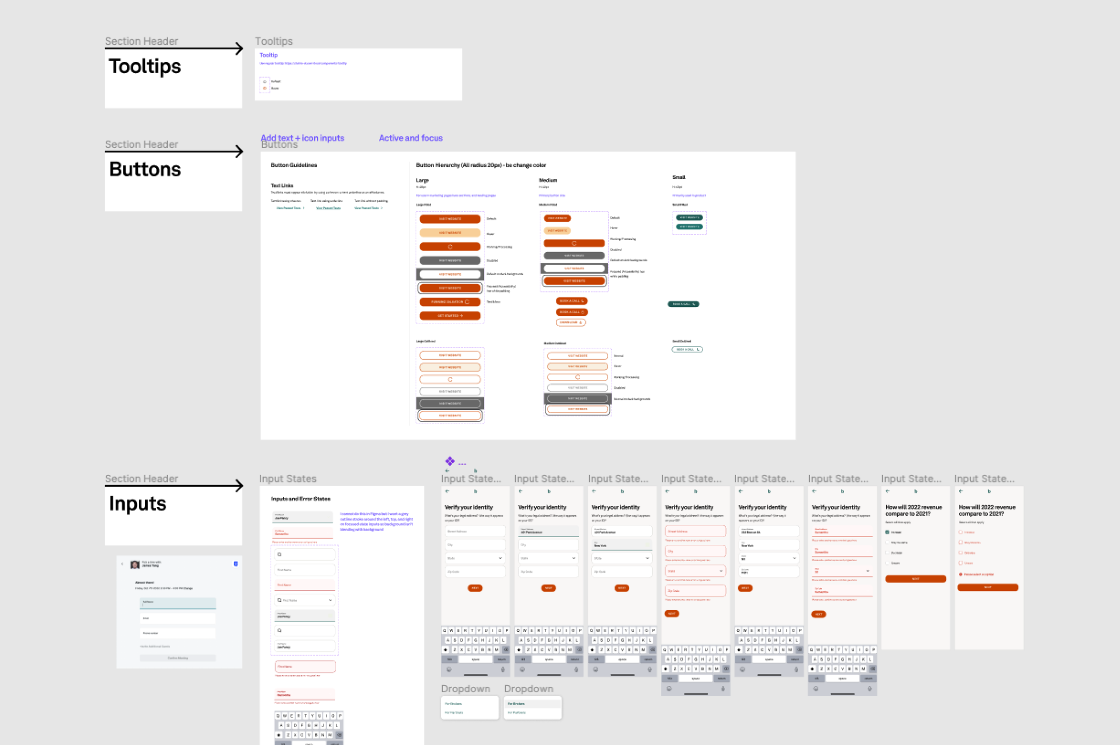
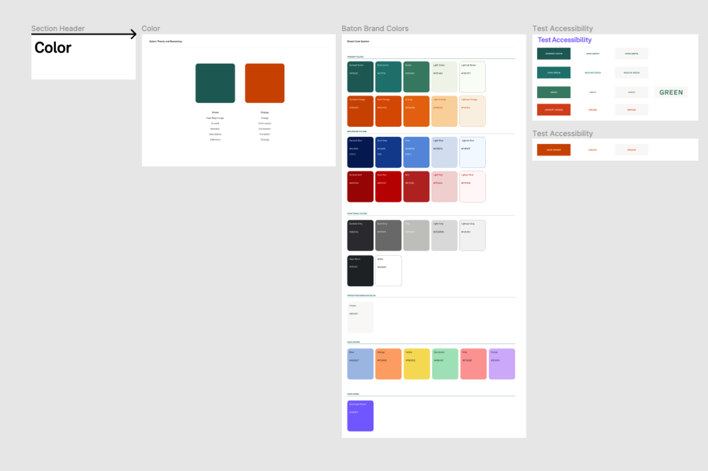
Our main focus was to build a more maintainable front-end ecosystem. In order to do so, we refactored Storefront and Moondancer to use the same technologies. By standardizing our stack, we empower future engineers (myself included) to easily work across both projects. At the same time, I worked with our Head of Design, Ann to create a design system and component library. This will help us build more efficiently and maintain consistency across the product. Here’s a peek at what some of that looks like:
Approach
Before embarking on this project, Moondancer and Storefront were using different systems and patterns for creating and styling frontend components and were missing valuable unit and integration tests, which was contributing to some fragility and impeding our ability to develop quickly and with confidence.
To resolve that and better align the stacks, we made a couple of specific changes. First, we migrated from JavaScript to Typescript. Typescript is a modern programming language built on JavaScript, with extended features that improve the developer experience, and it’s better suited for scale. This change ensures that neither Moondancer nor Storefront gets left behind or becomes harder to maintain.
A successful design system implementation relies on a partnership between engineering and design. Ann, our Head of Design, set up a detailed component library in Figma, which was the source of truth for how we wanted components to look, how they scaled on different screen sizes, and how they can adapt for different use cases.
We had not yet invested in a component library or tests, and both were critical to setting ourselves up for success. I chose to use Storybook, a frontend workshop for building UI components, to visually build out our new components. When we build a new component that we plan to reuse, I hook it up in Storybook so that Product and Design can conduct visual QA and reference existing component options when designing new features. I chose to set up Jest with React Testing Library to handle all our unit tests, and Cypress to handle our integration tests. The plan was to add unit tests to any new components that don’t contain business logic, and integration tests to handle user flows that do contain business logic. For the sake of speed and safety, we decided to write tests to validate behavior before the refactor began. If the tests all passed, then the change was safe. We have adopted a similar strategy for testing regressions.
To speed up component development, I chose to build upon Chakra UI, a simple, modular, and accessible component library that gives you the building blocks you need to build your React applications. I liked that Chakra UI works well with modern technologies (e.g., NextJS, TypeScript, and Storybook), there is an active community (helpful for seeking out best practices), and it’s easy to customize. In addition, Chakra provides a few hooks and a great styling system so we get the best of both worlds for building base components and styling solutions in one package.
Turning components into product
We chose Contentful for our CMS for Moondancer early on, because we wanted a headless CMS that can scale with us. This took an upfront investment that’s already paying off. Because we have a small engineering team, there’s a big benefit to being able to make content changes on Moondancer without needing to make a pull request, so we don’t have to prioritize Moondancer optimizations against feature work quite as often.
When it came to configuration, our goal was to empower the end user to make changes to copy and content, but with enough guard rails to ensure that no matter what, the site always looks polished, on brand, and consistent throughout. To accomplish this, we built a number of components that address different layouts and use cases but enabled customization of colors and the ability to combine components to achieve different goals.
Complex components
Here’s an example: One element of a marketing site that changes often is the Hero. For Baton, we had a few different hero layouts we wanted to have at our disposal, so the challenge was building one semantic component that can be customized to suit these different needs. Now we can showcase the power of Chakra UI here and walk through some of the code on how we accomplished this.
First, let’s assume we’ve already set up a base theme using Chakra UI’s styled system. Now we’re going to create a multipart component that has a few different variants which pull values from our theme. This is typically where stuff gets very complicated, but with the help of Chakra UI, we can do this with much less friction.
Here's what the style config for multipart components looks like:
export default {
  // The parts of the component
  parts: [],
  // The base styles for each part
  baseStyle: {},
  // The variant styles for each part
  variants: {},
  // The default values
  defaultProps: {},
}
Now let’s translate that into a Hero component that can support one or two-column layouts:
import { createMultiStyleConfigHelpers } from '@chakra-ui/react';

// This function creates a set of function that helps us create multipart component styles.
const helpers = createMultiStyleConfigHelpers(['content', 'heading'])

const Hero = helpers.defineMultiStyleConfig({
  baseStyle: {
    content: {
      background: 'grey.light', // using theme tokens instead of hex values
    },
    heading: {
      marginBlockEnd: '4', // using a theme token instead of hardcoded px values
    },
  },
  variants: {
    oneColumn: {
      content: {
        textAlign: 'center',
      },
      heading: {
        marginInline: 'auto',
	maxWidth: '3xl', // using a theme token
      },
    },
    twoColumn: {
      content: {
	display: 'grid',
	gap: '4',
	// the chakra way to handle responsive styles mobile-first
	gridTemplateColumns: {
	  base: '1fr',
	  md: '1fr 0.60fr',
	},
        placeItems: 'center',
      },
      heading: {
        maxWidth: '2xl',
      },
    },
  },
  defaultProps: {
    variant: 'oneColumn',
  },
});
Next, we’ll update the global theme object to include this new component style.
import { extendTheme } from '@chakra-ui/react'

const theme = extendTheme({
  components: {
    Hero,
  },
})
Now that we have some styling setup, let’s consume these into a react component.
import { Box, useMultiStyleConfig } from '@chakra-ui/react';
import Heading from '@/components/Heading';

type THero = {
  variant?: 'oneColumn' | 'twoColumn';
}

export default function Hero({ variant = 'oneColumn' }: THero) {
  const styles = useMultiStyleConfig('Hero', {
    variant,
  });

  return (
    <section>
      <Heading sx={styles.heading}>This is a hero heading</Heading>
      <Box sx={styles.content}>
        <img alt="cool helpful image alt text" src="/some-hero-image.webp" />
	<div>
	  Some hero content that works with a one or two column layout
	</div>
      </Box>
    </section>
  );
}
To help visualize, let’s see what a couple of Hero variants could look like:
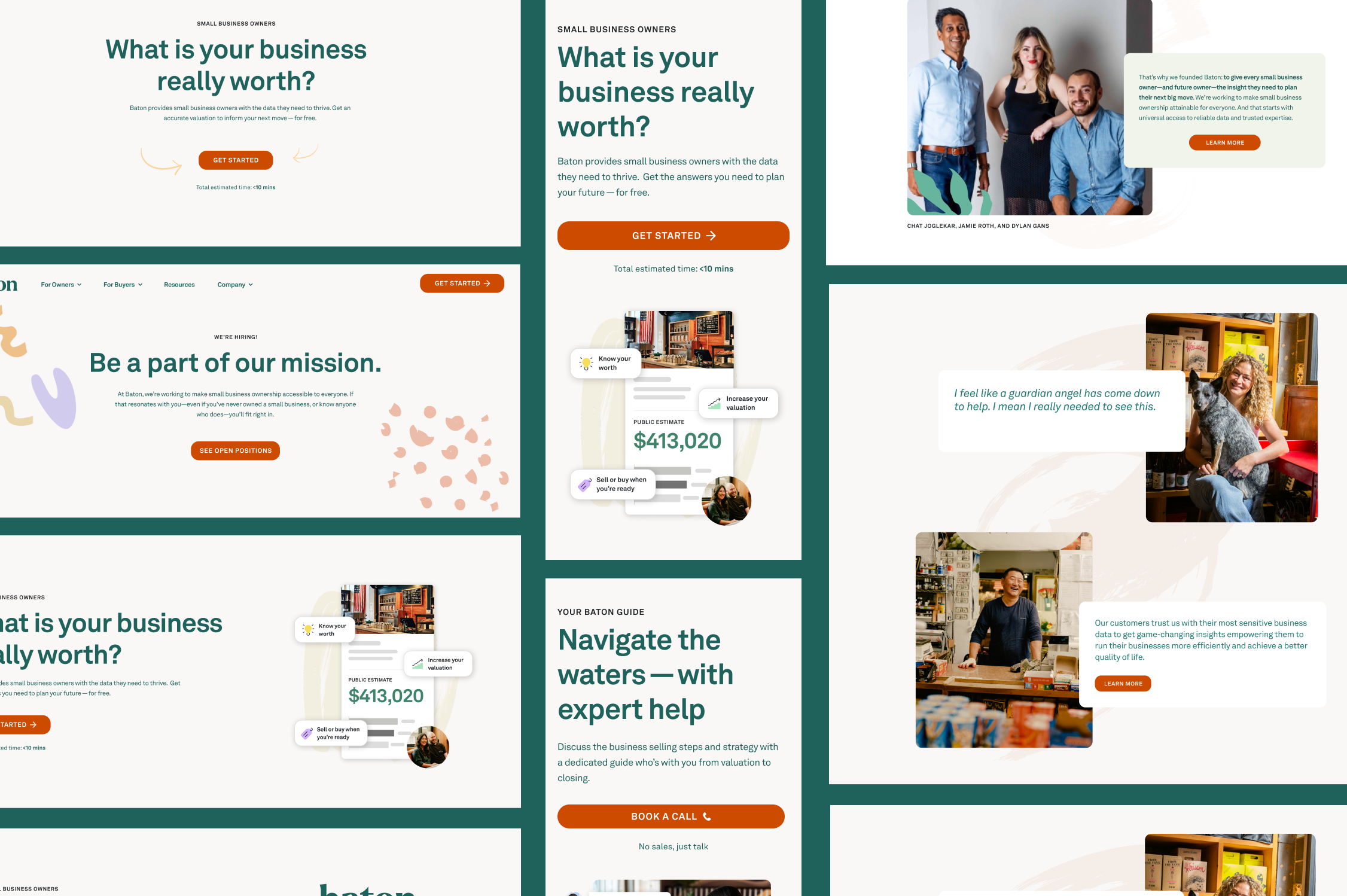
Baton design system hero component
We can now control the Hero variant from our headless CMS and let the content creator choose which layout of the component they’d like to use when building out a new page! This is a pretty minimal example but imagine now a component that can handle multiple variants, all with unique layouts, some dynamic content, and maybe even different color themes. The extendability here is pretty incredible!
What’s next
Now that we’ve laid the foundation for a scalable front end, we are moving faster and building more confidently! Each new feature gives us the opportunity to improve existing components and add to our test cases. These small improvements add up to a consistent and ever-improving user experience.